Jumping into the rabbit hole of color theory/color rules and all of the benefits it can have on your designs can be a daunting task.
Fortunately, Adobe Color, a free feature from Adobe, simplifies the task for you with the help of its AI engine Adobe Sensei. Let’s take a look at how the Adobe Colors tool works and how it could significantly improve your design work.
How do I know what I’m talking about? Head to the DigiProTips Experience and Background page to find out how I’ve built up my knowledge over a career spanning feature film, broadcast TV and digital content production.
The Quick Answer to Using Adobe Color Themes Extension
The quickest way to get working with Adobe Colors is to find a base color you want to work with and input that color’s HEX key into the middle color under the color wheel at color.adobe.com.
Now choose from the selection of options on the left hand side for how Adobe should pair colors with your base color. The resulting colors under the color wheel are your new color theme to work with in your design.
You can also extract a color theme from a image using the ‘Extract Theme’ tab next to ‘Color Wheel’.
Now select the extension from Adobe Photoshop, Illustratr, InDesign or After Effects to utilise you’re newly created theme.
So, What is Adobe Color?
Whether you are creating a logo, starting a YouTube channel, color grading a short film, animating a motion graphic explainer video or compiling brand guidelines for a company, you will always come to a point where you need to make a decision on color.
Having a color theme to work with is a great position to start from and with Adobe Colors you can do just that.
Color work isn’t easy and for beginners it can be an absolute minefield. It takes years of practice working with and knowing how to apply color correctly.
Adobe are trying to negate that learning process and help all designers everywhere with Adobe Color.
Recently rebranded, from Adobe Kuler, the tool has been given some incredible new skillsets, powered by the ever improving Adobe Sensei AI engine.
Adobe Color uses the basis of color theory to apply what it refers to as ‘Color Harmony Rules’ to create differing options for a color theme from your base color.
It doesn’t stop there though, with Adobe Color’s incredible features you can now use the built-in extractor or use the complementary Adobe Capture app to create a color theme from an image you like.
Without going into too much detail it’s important to point out what the colour wheel is and how it’s used by Adobe Color.
A Quick Note on Color Theory
All good color design work is founded on the principles of color theory. Color has an effect on perception, mood and energy. It’s important to tap into and use that to your advantage as a designer.
Color theory is broken down into three main sections of color; primary colors, secondary colors and tertiary colors.
Primary colors are red, yellow and blue. Secondary are two of those colour mixed, so orange, green and purple. Tertiary colors are then a primary and secondary color together.
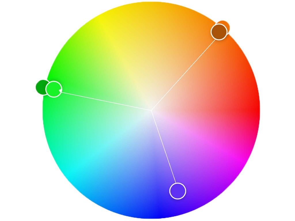
All of these colors are represented on the color wheel with a primary color sitting opposite a secondary color mixed from the two other primary’s. For example blue sits opposite orange, which is in-between yellow and red.
These opposites are known as ‘complementary colors’, an option you can find on the side in Adobe Color.
The color wheel and where colors sit against or next to each other, all have bearing on how an image looks and how it is perceived by a viewer.
It’s no mistake that scenes in films that make you feel happy and have a good energy to them are graded to be warmer in color, i.e. using reds, yellows and oranges. Similarly, it’s a color grader’s intention to exact feelings of tension, sadness and mystery by using cooler colors such as blues, greens and purples.
It’s all color theory at work here.
How to Use the Adobe Color Themes Extension to Your Advantage
So, now you know what Adobe Color is and a little about color theory it’s high time I showed you how to use it in some of the Adobe Creative Suite applications.
Adobe Color and the Themes you create can be used seamlessly between the Adobe Color website and Adobe Capture app with the following Adobe applications: Adobe After Effects, Adobe Photoshop, Adobe Illustrator and Adobe InDesign. Unfortunately, the extension isn’t currently available to use in Adobe Premiere Pro.
I’m going to focus on After Effects, as DigiProTips is mostly aimed at video professionals but this is applicable to all of the above applications.
Follow the quick answer at the top of this article to create a color theme in the Adobe Color site or using the Adobe Capture app and save it to your Creative Cloud profile.

Now head to Adobe After Effects and open the project you want to use this new color theme within. Once your project is open, go to Window-> Extensions -> Adobe Color Themes.
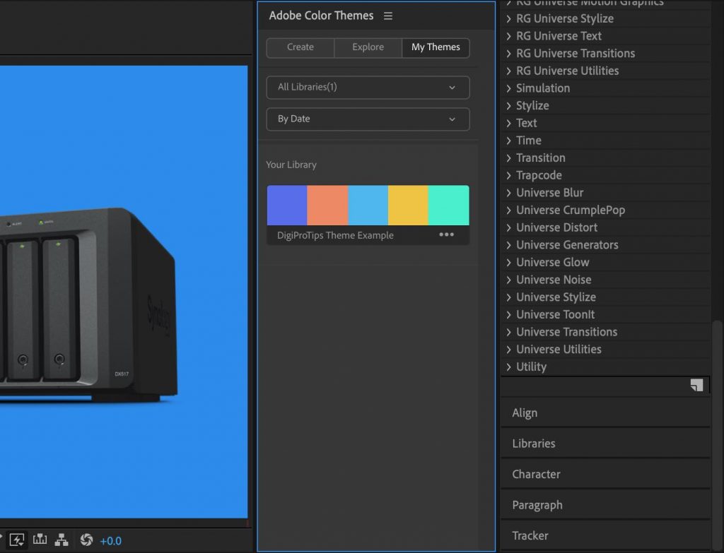
This will open up a new panel where you should see your new theme instantly available in the panel.
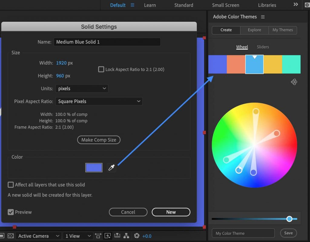
You can click any of the colors in your theme, open your layer color properties and use the eye dropper tool to copy it. This can be used for coloring any object or layer in your composition.
Easy, right?!
This is great when you have been given a visual reference image from a client to match colors to. You can extract a theme from it on the Adobe Color site and then have those colors to use in your composition straight away.
The Difference Between the Color Harmony Rule Options
You will have noticed that there are quite a few options available to you when it comes to choosing which color harmony rule on the Adobe Color site.
Each one has specific settings within the system for the colors it will produce.
I’ve listed them below so that you know what to expect when using each one.
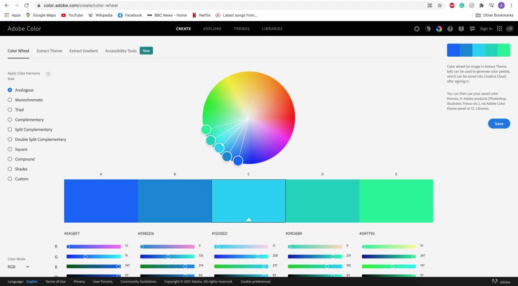
Analogous – Analagous color themes usually work well because the colors it picks are all adjacent to each other on the color wheel, meaning that they should blend well together and be pleasing on the eye.
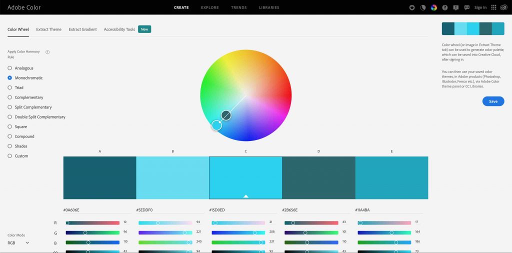
Monochromatic – Monochromatic themes have a soothing effect on the eye by blending together 5 colours that are variations of saturation and brightness from a single color.
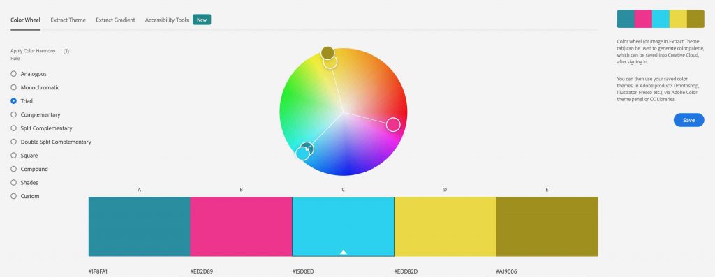
Triad – Triad colors are contrasting colors, meaning the colors are not adjacent to each other and slothful oppose each other but not as much as complementary color themes do below. The tool will present colors from equidistant points around the wheel. It uses two colors of the same hue but different saturation and brightness from the first color you input and then two colors from the second point and one from the third.
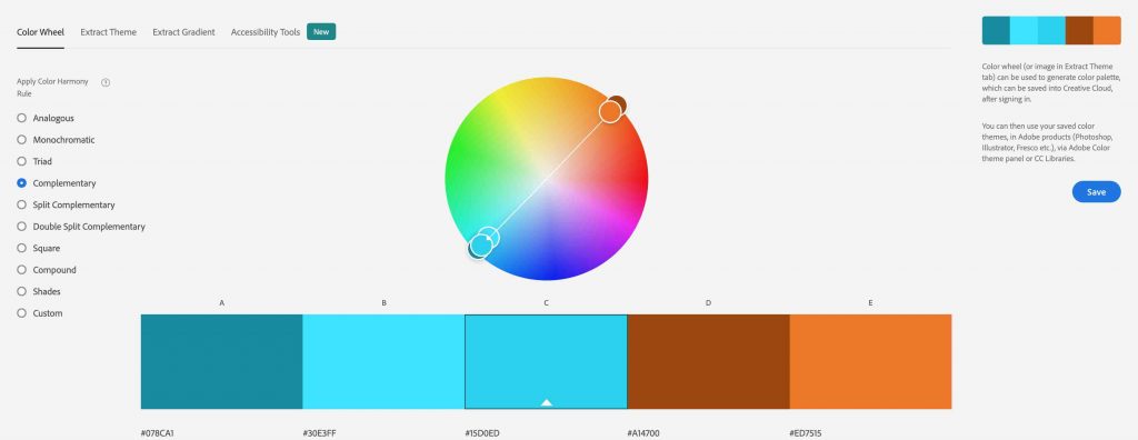
Complementary – It may sound strange but complementary colors are colors that oppose each other on the color wheel. It just so happens that opposing colors complement each other.
This rule shows the base color itself and two colors with the same hue and then another two colors from the opposite side of the wheel.
Complementary color themes provide high contrast and are good for creating visuals that stand out.
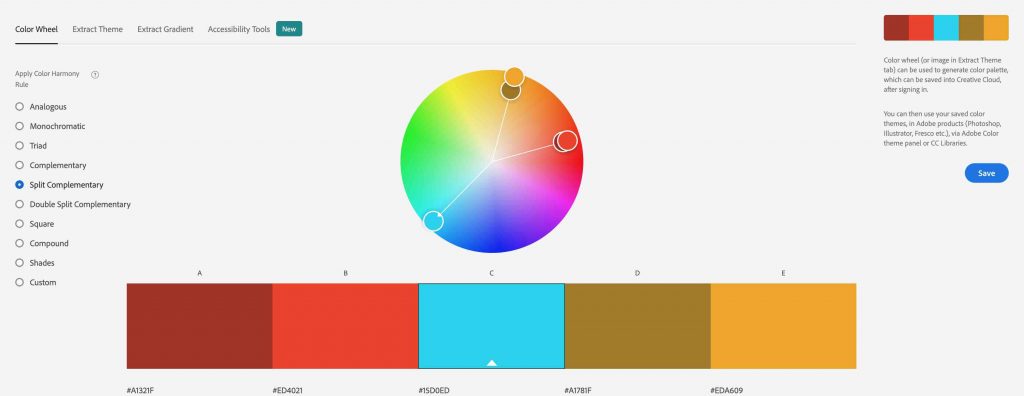
Split Complementary – Split complementary rules use one base color and two secondary to provide the five colors. Instead of complementary colors the rule will show two colors that are placed symmetrically around the wheel to provide one warm color and two cold (or vice versa).
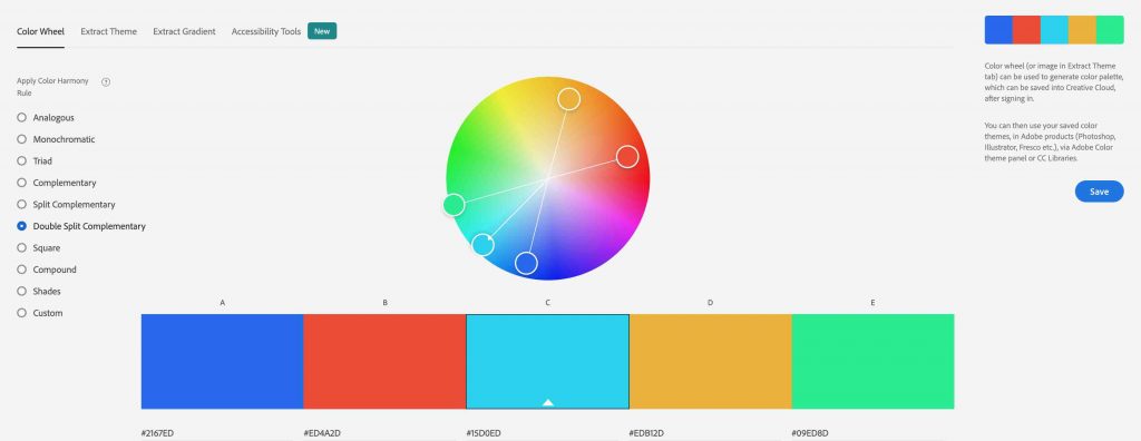
Double Split Complementary – Creating an X on the color wheel, this rule shows 2 pairs of complementary colors.
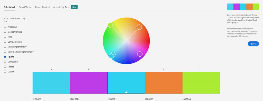
Square – As it says in the name, square color harmony rules provide four colors spaces evenly around the color wheel.
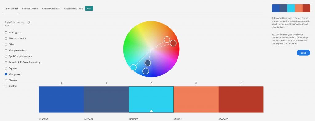
Compound – Compound blends the complemoand analogous rules together. It shows two colours with the same hue as the base color, the base color itself and the colors opposite to the base color.
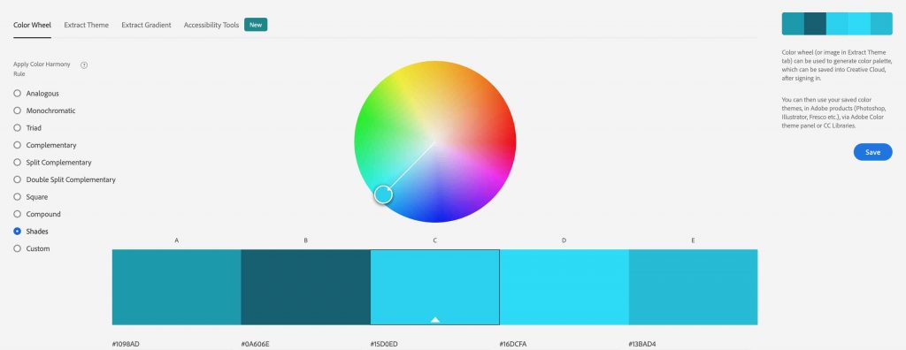
Shades – This rule provides five colors that have the same hue and saturation but different brightness values.
Adobe Color Explore & Trends
You will have noticed that at the top of the site there are also tabs for Explore and Trends.
These are great areas to check out for inspiration and getting ahead of the curve when it comes to design and color work.
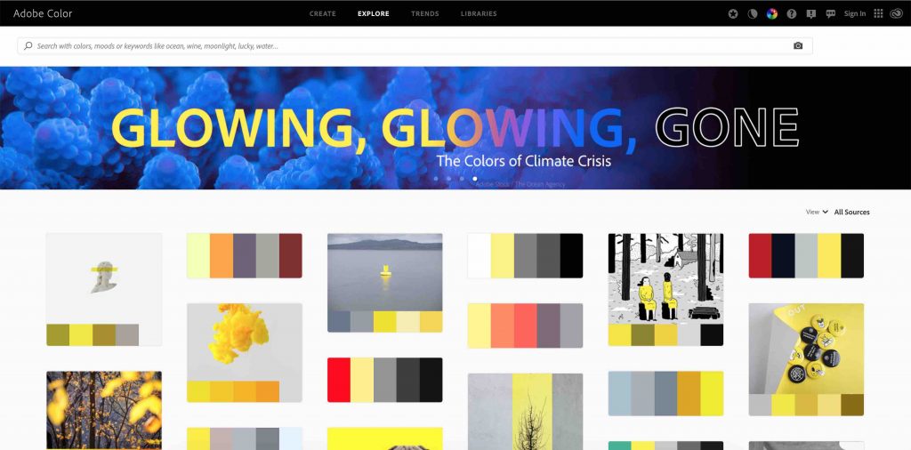
Explore shows you some of the publicly published Color themes from other users for you to take and use in your own creations.
This is a great option if you don’t feel like coming up with your own and want to just browse for something that catches your eye or fits the brief you have been given.
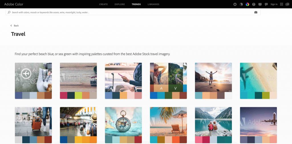
Trends is an even better tab, in my opinion. It shows you color themes that are trending within certain categories, like health and fitness to travel and mindfulness.
You can use these themes to keep up with the latest trends in your industry and even to stay ahead of the curve or set the trend.
If you are creating a brand logo or set of brand guidelines for your company then I’d highly recommend taking a look here for your industry and see what’s hot at the moment.
Practice, Practice, Practice
Color work isn’t easy. Especially at the beginning where the learning curve seems quite steep.
Adobe Color takes some of the steps in learning Color theory out of the equation and makes your life easier and ultimately more professional, by using color themes that are pleasing on the eye.
That’s working smarter, not harder and that’s what DigiProTips is all about.
Practice using the tools and apply the results in your creations to see how color affects the look and feel of your design.
If you found this tutorial useful then let me know in the comments below what you use Adobe Color for and what you would like help with next!
For more content on color, why not check out my guide to color correcting using scopes:
Or for more After Effects tutorials check out my guide to the most underrated shortcuts:

DigiProTips

