Aspect ratios are a hot topic right now for social platforms. YouTube, Facebook, Twitter, Instagram, Snapchat etc all have different video size formatting preferences and knowing what to use where and when can be extremely confusing.
Unlike TV and Film, which for the majority stay to the conventional widescreen 16:9 or 2.39:1 aspect ratios, the digital media world is ever changing as it looks to capitalise on new and emerging technology and user habits.
So, What Is An Aspect Ratio?
To get a better understanding of how we’ve got here it’s probably worth understanding what an aspect ratio actually is.
Simply put it’s two numbers that depict the vertical height and horizontal length of a video.
The first number of the two will tell you the dimension of the horizontal length and the second number is the proportionate vertical height to that horizontal length.

So, for example, a widescreen video using 16:9 will have a horizontal pixel length of say 1,920 pixels (for 1080p HD video, it would be 1280 for 720p HD and so on). The vertical height would be a ninth of that horizontal length which is 1,080 pixels (1920/16=120 x 9=1080).
A Brief History
Aspect ratios used to be relatively simple. You had TV and you had film. Before the 00s TV’s were pretty much 4:3 only (remember the squar-ish big TVs with massive backs to them?) until they started to move towards widescreen 16×9.

This was the domain of film up until that point. Although film has had a checkered history with varying ratios to try and get the best field of view in theatres and the best cinematic experience. You could pretty much expect by the 00s that films would be in some form of widescreen 16:9 or 2.39:1 (that nice black crop look that for anamorphic footage that many YouTubers have tried to emulate).
Now, however, the world of digital video, social media and personal smart devices have changed all of that.
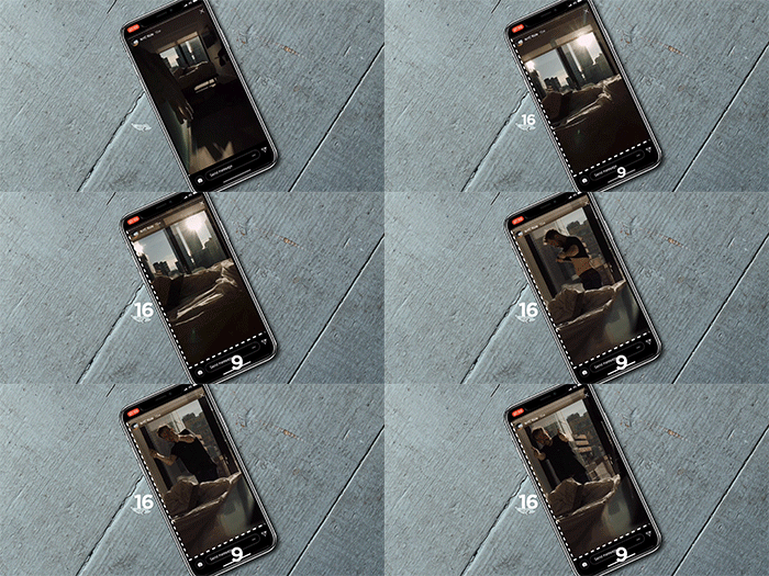
Square video has a dominance on social media for sites like Instagram and Facebook. These videos are exactly square in ratio being 1:1. That was hard enough to swallow for the widescreen purists when it first emerged but it has diverged a lot from just square now as well. If you use social media platforms at all you will know that there is 4:5 for slightly portrait looking posts. There is 9:16 for properly portrait media that usually sits in ‘stories’ like Instagram, Facebook and Snapchat. There is also a small movement for 4:3 again as it offers a slightly wider view than 1:1 but still quite square.
Why? Why has this happened?
Technology.
It comes down to the tech we use in the palm of our hands and user habits.
Square and portrait video mean that users do not have to rotate their screen to get the optimal viewing experience. The user can carry on scrolling through their feed without having to move the device.

There are still platforms such as YouTube that continue to champion widescreen viewing. This is mainly due to the wide proportion of the YouTube audience who view on desktop or smart TVs. But even YouTube has ‘stories’ feature.
How do you take advantage of this?
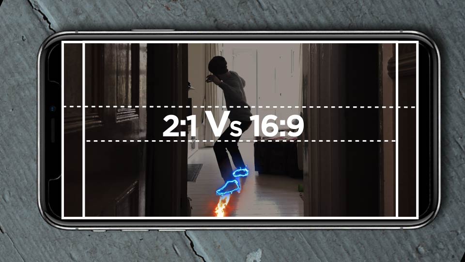
A popular new emerging widescreen format on YouTube is 2:1 as it fills more of a users phone real estate. Desktop viewers will actually see a slight reduction in screen real estate usage but as the majority of viewer come from mobile devices this is the push for this format.
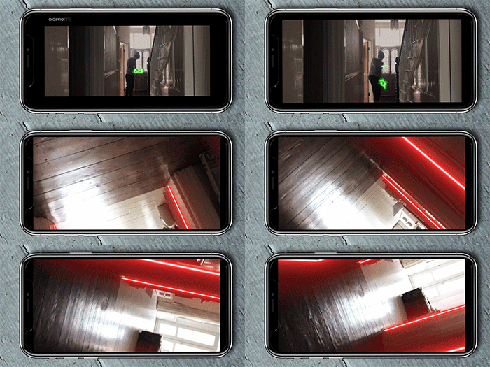
A 2:1 aspect ratio is relatively easy to use in post and has no shooting implications either. For example, if you shoot in HD 1920×1080 then to turn this into a 2:1 video all you need to do is create a timeline in your NLE with pixel dimensions of 1920×960 (1920/2=960). This will ultimately mean you have 60 pixels on the height of your video that get automatically cropped out of frame.
It’s that simple.
Give it a try and give some of the other aspect ratios mentioned a try to see how they work for your content styles.
Note. You can get Adobe Premiere Pro for $20.99/£19.99 a month or the whole Adobe Creative Cloud Suite for $52.99/£49.94 right now and if you are a student or teacher you can save up 39% on those rates too:
DISCLAIMER: This post may contain affiliate links. We make a small commission if you buy the products from these links (at no extra cost to you). As an Amazon Associate, I earn from qualifying purchases. But we only recommend products we would use ourselves. For more information, click here to see our disclosures.
Premiere Pro Auto-format
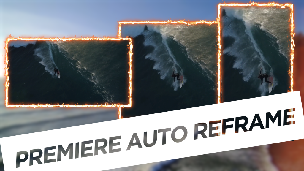
One thing to note is that the new version of Premiere Pro coming out is going to have a feature that will automatically crop, scale and keyframe your content into different aspect ratios for different platforms.
We’ll keep you updated on this when it drops.
In the meantime, have fun experimenting.
UPDATE: The new Premiere Pro Auto-Format is here, check out our first look here:
DigiProTips

Pingback: How to Get the Best YouTube Channel Studio Setup - for the Lowest Budget -